Looping · Native mobile app · 2017
Getting families off the paper calendar.
Looping helps families, friends and loved ones plan their events together. It was my first product design role, and I worked on everything from the first screen to the app icon and the illustrations.
01 — Login and tour
A first screen for people who still trust the paper calendar.
Problem. Many people Looping was for kept a paper calendar on the fridge, and some weren't confident with technology. The login and the four-screen tour were the first thing they saw, and they leaned on a row of dots and buttons that all looked alike.
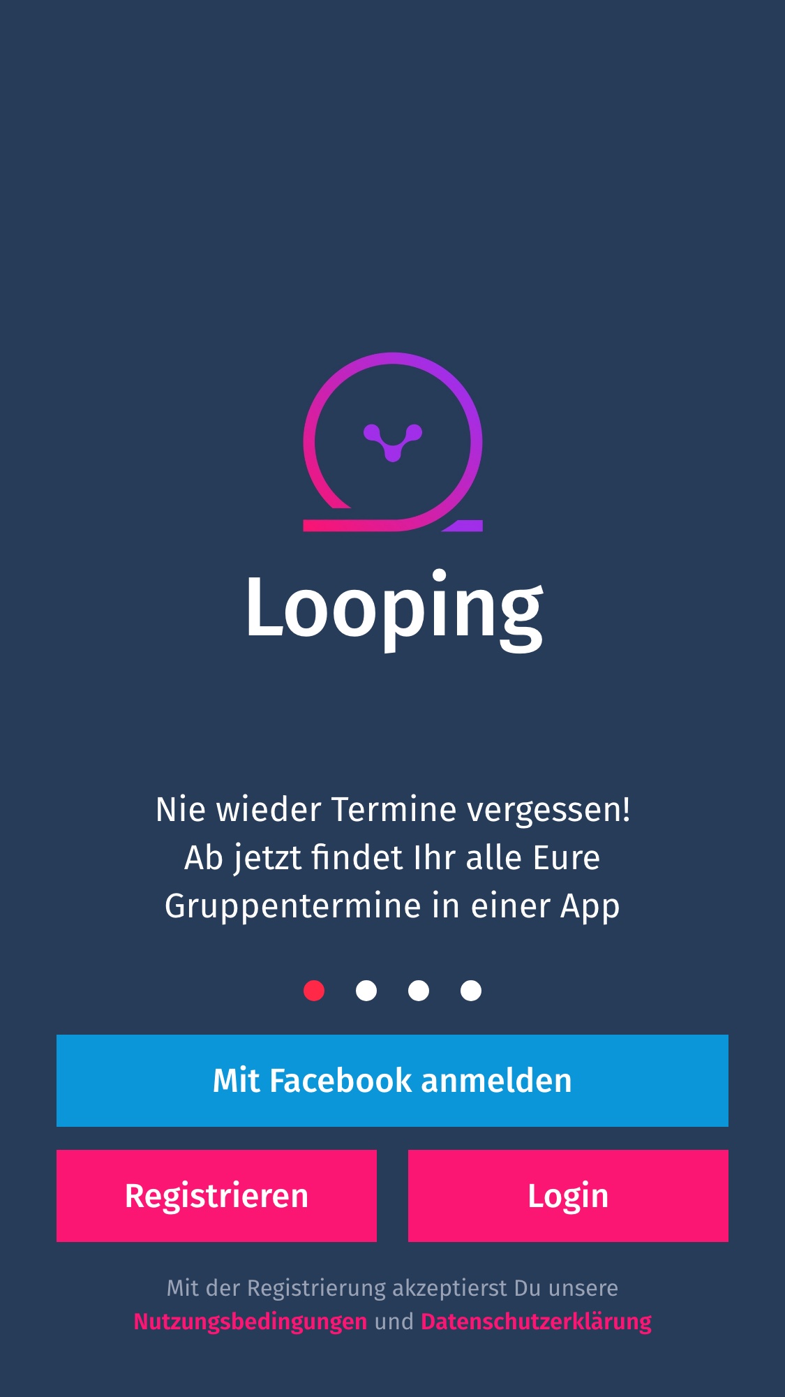
Before: four dots and two equal buttons.
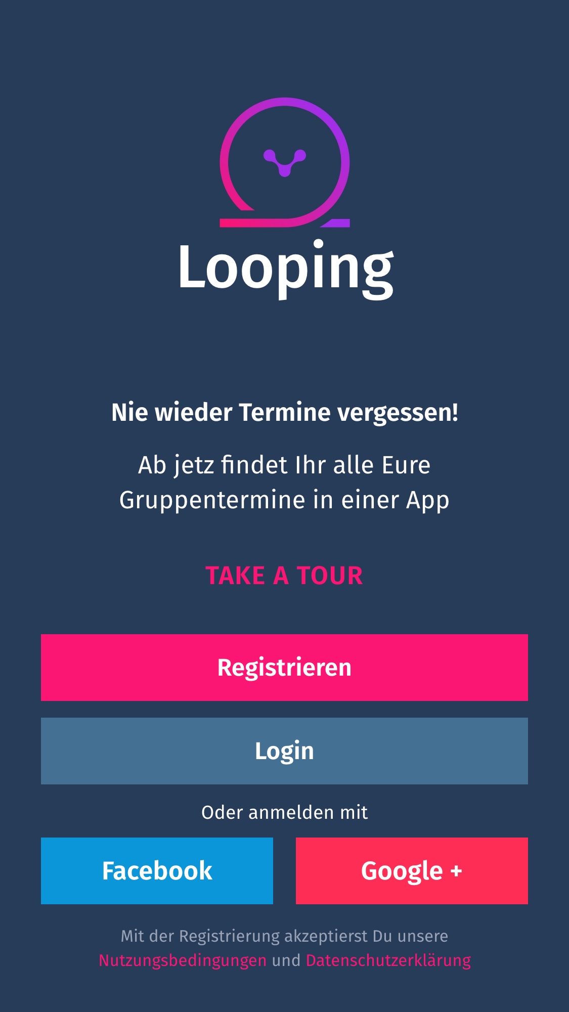
After: one primary action, and the tour in words.
What I changed on the login.
Visibility
A "Take a tour" link replaced the four dots. For people new to apps, words say there's more to see. Dots don't.
Hierarchy
Register became the one pink button and Login a quieter one below it, so the two stop inviting the wrong tap.
Flexibility
Google joined Facebook as a shortcut in, to give new people one more way to sign up.
Typography
Different sizes and weights separate the promise from the explanation under it.
Then I tested it with 53 people.
On UsabilityHub I showed the old and the new login to 53 people, recruited on Slack and Facebook, and asked which design would get them to register or log in.
60%chose the new design, 32 of the 53 people.
People who picked the original liked its minimal look. People who picked the new one liked having more ways in. The new login shipped.
A tour that works without swiping.
I added arrows next to each title, for people with limited gestures and for anyone not used to swiping through an app, probably the same people with the calendar on the fridge. Each screen explains one thing, and a single "Get started" button leads back to the login. I animated the illustrations in Principle to give the tour some life. The tour didn't ship before I left.
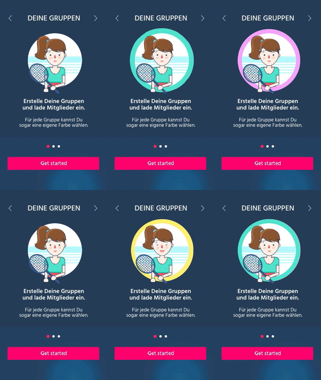
Groups, animated
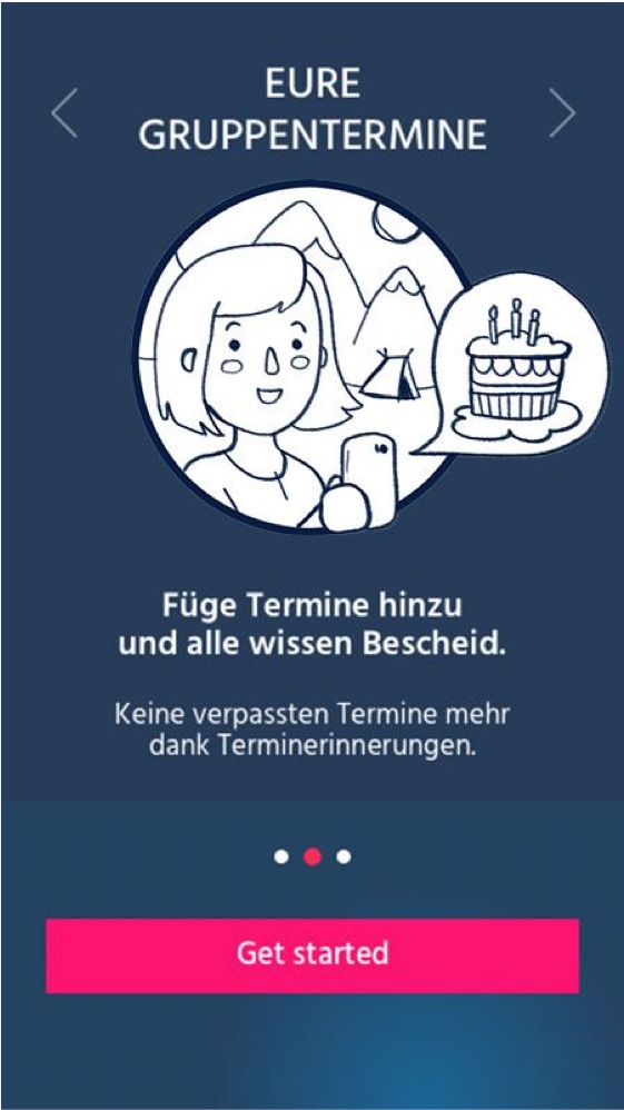
Shared events
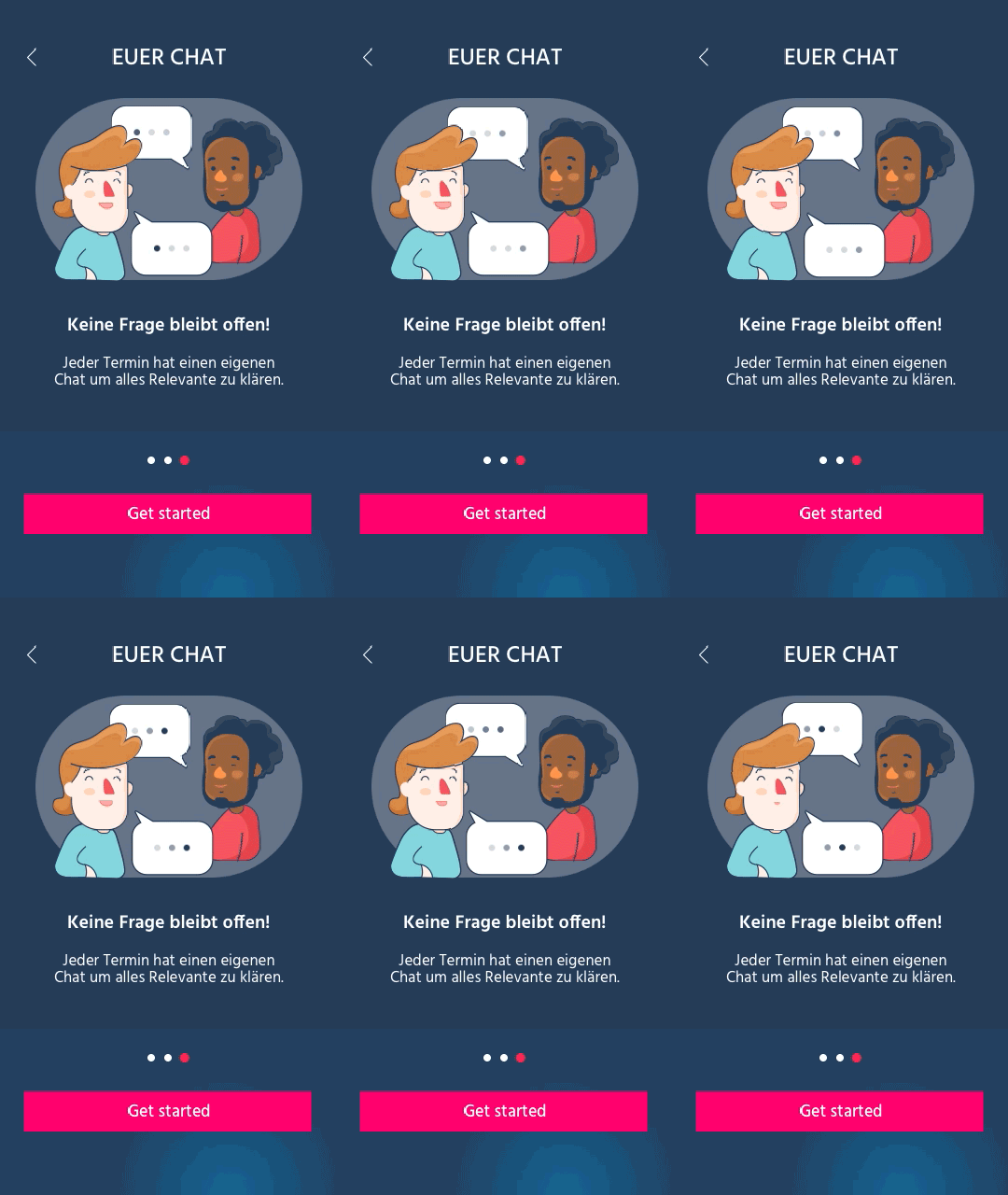
Chat, animated
02 — App icon
A logo that reads at every size.
My task was to redesign the Looping logo. The new logo uses the brand gradient as its main color, which makes it stand out and feel friendlier. I also made the line thicker, so the loop still reads on the smallest app icons.
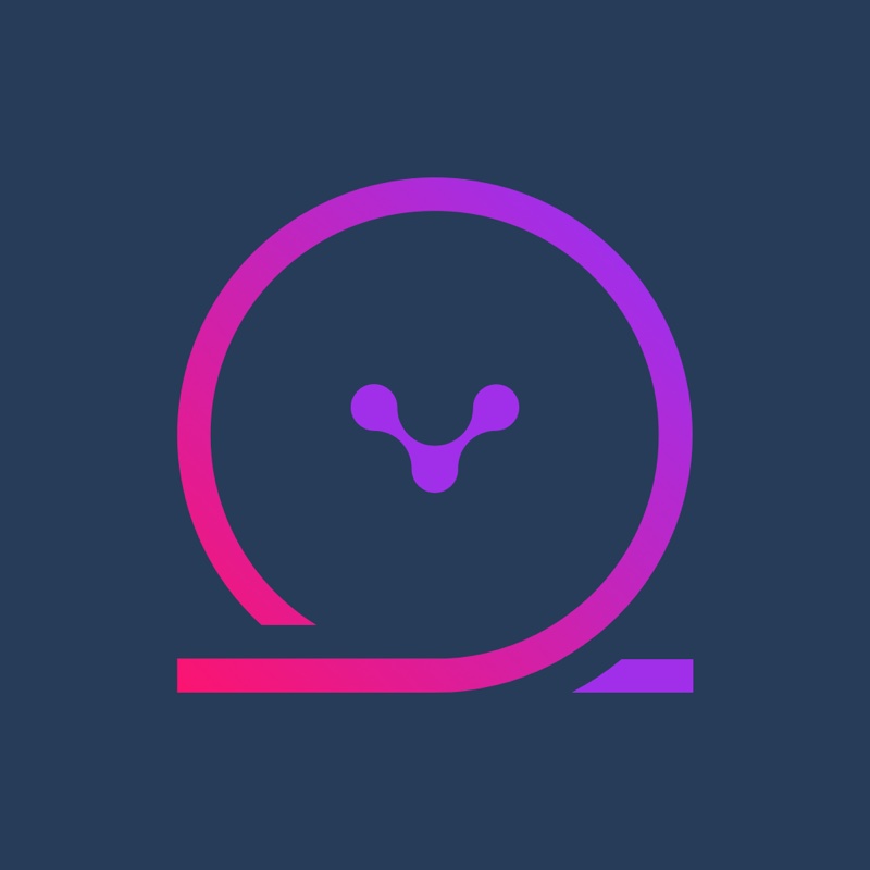
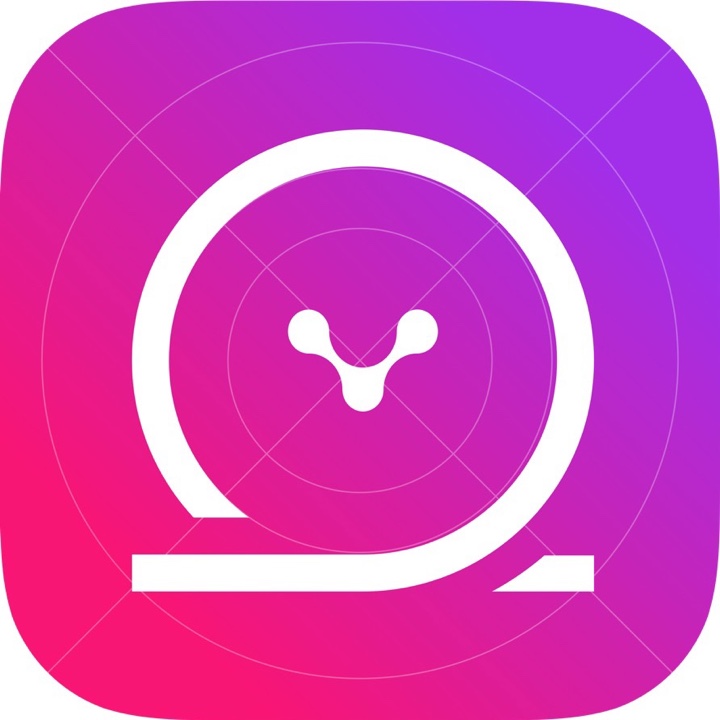
- 167
- 120
- 76
- 40
- 29
03 — Calendar illustrations
A picture for every month.
Problem. People stuck to their paper calendars. How could an app compete with an old habit?
Solution. A paper calendar often has a photo or an illustration for each month. So I proposed header illustrations for each month in the app, and drew them. The calendar felt friendlier as a result.
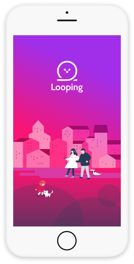
Start screen
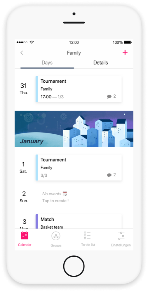
January in the calendar
Scrolling through the months
04 — Group colors
Groups that look like the people in them.
Business question. How could we improve the experience for the people already using Looping?
User need. Identity through self-expression. People wanted their groups to look like the people in them.
Solution. More ways to customize a group: eighteen new colors to choose from, and a photo for each group.
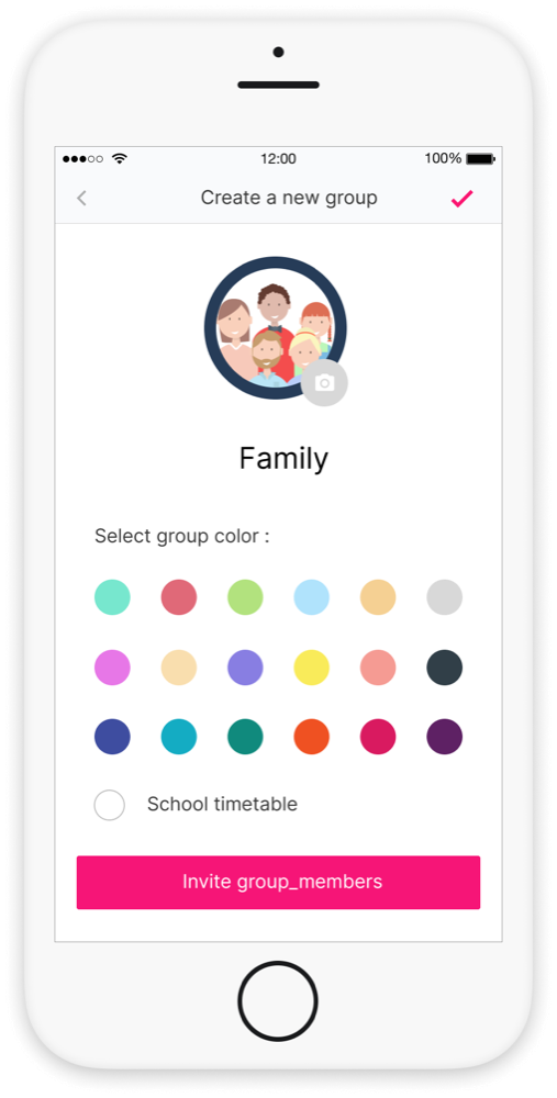
Creating a group
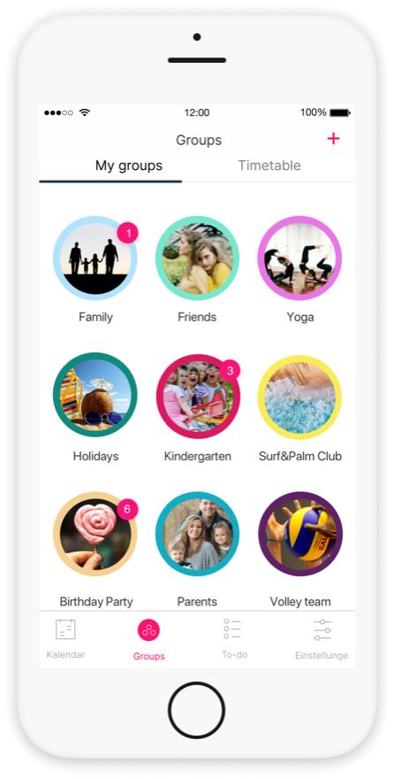
My groups
Picking a color and a photo
05 — Feature mockups
Mockups for new features.
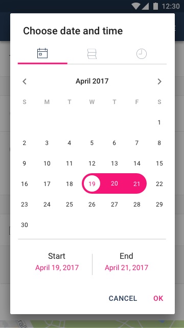
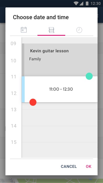
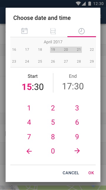
Low- and high-fidelity mockups that followed the brand guideline. Picking a date and time is one window with three tabs: choose the days, drag a slot between the events already planned, or type the exact time.
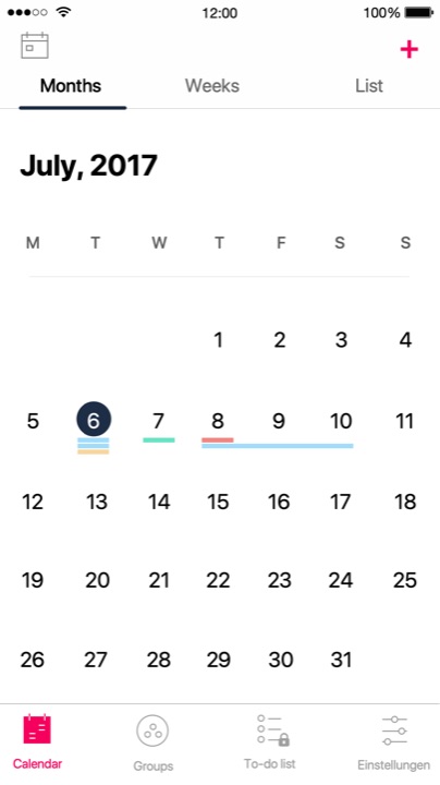
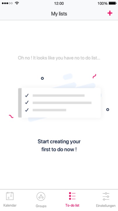
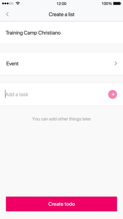
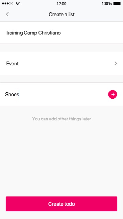
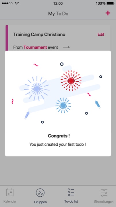
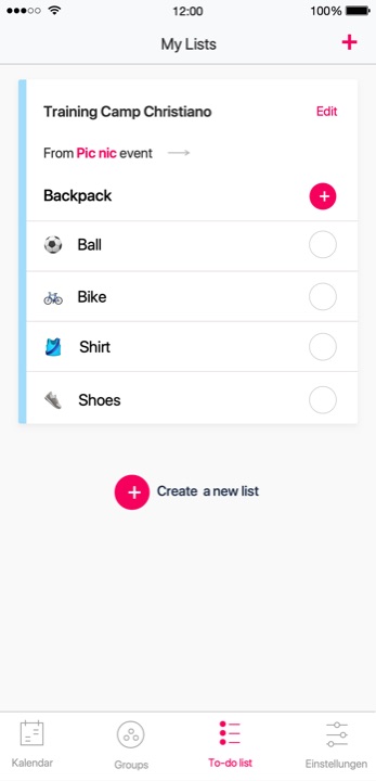
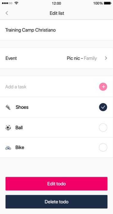
A to-do list belongs to an event, so a packing list for a training camp sits right next to the camp in the calendar. It goes from the first empty screen to a small celebration.